Use color as a language and then influence the world
For PANTONE, the color of 2024 has a different meaning. The release of Soft Peach means that the series ushered in the 25th anniversary.
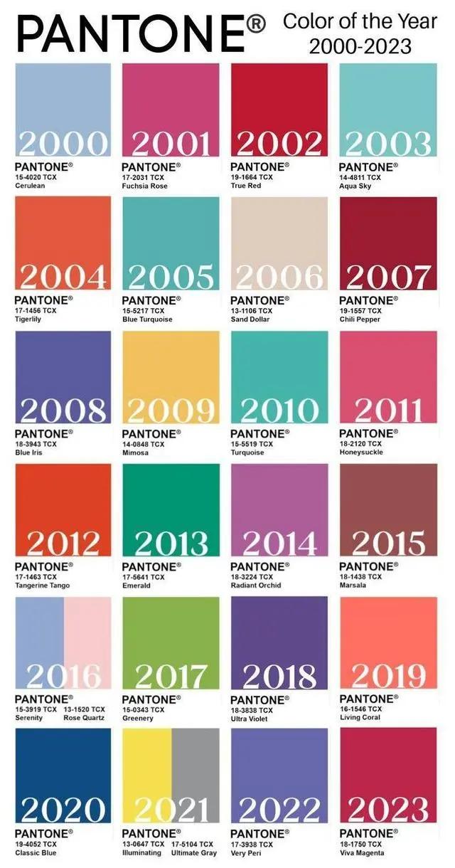
▲ The color of the year from 2000 to 2023.
Each year, they send a team of 10 people to spend an entire year running around the world looking for color inspiration from different cultural perspectives, such as food, cars, clothing and household items.
Using a certain color to capture the spirit of The Times, and even hoping to use it to influence product design and consumer aesthetics, the ambition is not small, and it will not let everyone pay.
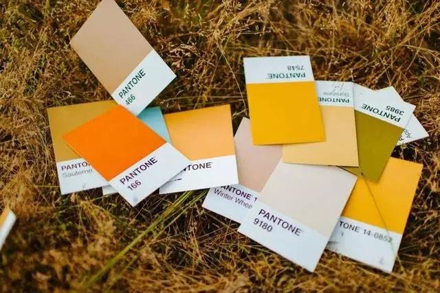
But PANTONE has kept this thing going for more than 20 years, capturing a certain subtle collective mood in an atmosphere of chaos and anxiety that is arguably its comfort zone.
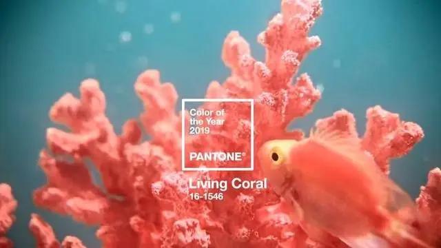
The bright “coral orange” in 2019 represents the concern and vigilance of climate change, but also makes people feel warm, reassuring and intimate in the change, just like the coral reef breeds Marine life.
The fresh “greenery” of 2017 echoes the greenery of daily life, bringing hope to people in a troubled social and political environment.

In addition to the just-announced colors of the Year 2024, PANTONE also released its Spring/Summer 2024 Color Trends report in September, focusing on what’s trending at New York Fashion Week and London Fashion Week.
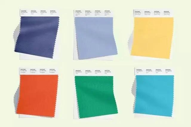
PANTONE, it must be said, has a flair for naming: national treasure Tea Red, Orange Orange, watercress Green, Desert Pink, Chambre Blue, lilac Pink, Marin Blue, lemon sugar yellow, mint green, Capri Blue……
Although there are more options, the core is no different from the soft one: “The desire for personal self-expression becomes the core of fashion.”
In 1965, the first PANTONE color matching system for art materials was released, and later PANTONE added color matching systems for pigments, plastics, powder coatings, screen technology, and textiles, establishing a set of the most universal color language.
Color circulates among human designers in the form of a unified color number, while in nature, it is sound to the ear and color to the eye, and color itself is a communication tool, across gender, generation and region.

The color organization represented by PANTONE gives color more and more concepts, elevating it to the height of spiritual needs, but for most people, sometimes it is the feeling at the first glance.
The first PANTONE color of the year was Cerulean Blue in 2000. The color of the sky on a crystal-clear day echoes the hopes of millennial people for the future.
In the era of real technology, the aesthetic has gone backwards to the retro. If 2000 is to embrace the unknown, 2024 is to quietly look inward, our emotions need some gentle things to lift, this may be the meaning of soft peach.
作者:爱范儿
************************************************************************************************************************************************************
免责声明:本文版权、图文归原作者所有。为尊重知识产权,我们会尽可能注明来源,若不愿转载,请通知我们予以删除。我们对文中观点保持中立,仅供参考、交流之目的!
